Tutorial:Layout rules for graphs
Highlights
This tutorial is part of the guidelines Layout rules for tables, graphs and maps, using the Excel add-in.
It describes the layout rules for Eurostat graphs produced with Excel in Statistics Explained and some publications such as 'Statistical working papers' and 'Manuals and guidelines'.
In order to get the right lay-out, please have a look in the chapters below:
Full article
Protocol order of countries in a graph
Before you start the layout of the graph, please check that the order of displaying the countries is correct. It is recommended in graphs to display the countries sorted by value in ascending or descending order. It is also recommended to group the countries as it is done in tables in the following order:
- EU and EA (if relevant) aggregates, followed by a blank space
- Member States, followed by a blank space
- EFTA countries, followed by a blank space
- Candidate countries, followed by a blank space
- Potential candidates, followed by a blank space and other countries.
Colour palette
How to choose a colour palette
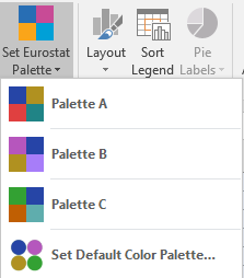
All Eurostat dissemination products now use three available colour palettes: one corporate one (Palette A, dominant colour Cobalt blue), one warm one (Palette B, dominant colour Fuchsia) and one cold one (Palette C, dominant colour Forest green). The warm and cold refer to the dominant colour tones. You can choose any one of the three palettes - however, make sure you only use one palette per article to ensure consistency.
The appropriate colour palette can be set using the Set Eurostat Palette command. This command also sets the default font to be used (for the current workbook).
Default colour palette
If you use the same colour palette for all workbooks you create, you can set a default theme by using the Set Default Colour Palette command in the Set Eurostat Palette menu.
When calling this command, the Default Colour Palette dialog box is displayed.
Formatting charts
Once the colour palette is set, the charts need formatting. One click on the 'Layout' button is sufficient in most cases to format charts according to the Eurostat layout rules. Text labels, gridlines, legend, borders and y-axis are formatted according to the layout rules. These rules applies also to bar charts, stacked bar charts as well as for line graphs. Some details differs for pie charts as explained in the section below.
If you have one chart to format, you should click on the Layout button.
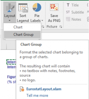
If you have two or more charts beside each other, the submenu Chart group should be used. This command is used for the lay-out of a group of charts, for example two pie charts . This command enables a layout with only one logo and one source area for the PNG. Thus, when you layout a chart to be published as a part of a group, the layout command should not add the logo and source. Instead, these parts are added, when saving the charts as PNG. This formatting is explained in detail in the paragraph 'pie charts' below.
How to format a bar chart step by step
- Select the chart
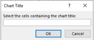
- Click on the Eurostat layout button. The following dialog box is displayed: Chart title.
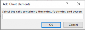
- Select the title and subtitle of the chart and click on OK. The following dialog box opens: Add chart elements.
- Select the note, footnotes and source and click on OK.
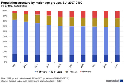
- Your chart now follows the basic Eurostat graphical guidelines for charts:
Saving chart as png for Statistics Explained
To create a PNG file for a chart, do the following:
- (1) select the chart and click on the layout button
- (2) In the excel worksheet, select the cells containing the chart title
- (3) Select the cells containing the source, footnotes and notes. The chart is formatted and contains the title, subtitle, footnotes, notes, source and the Eurostat logo.
- (4) Select the formatted chart to be displayed in the PNG.
- (5) Click on the Save As PNG button.
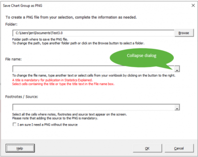
- (6) The following dialog box appears:
- (7) By default, the PNG is saved in the same folder where the active Excel file is located. The file name is extracted from the chart title. You can modify the folder and file name as needed.
- (8) Click on OK to save the PNG file.
Pie charts
- Create a pie chart as follows:
- Click Layout in the Chart group . The following dialog box will be displayed:
- Select the cells containing the chart title and click on OK. The following dialog is displayed:
- Select the note, footnotes and source and click on OK. The chart now follows the basic Eurostat graphical guidelines for charts:
Rounding problem in pie charts
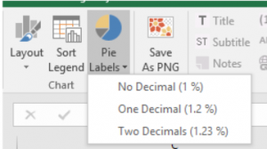
Sometimes Excel shows an incorrect percentage value on pie chart slices. This rounding problem can be solved if the slices show more than one decimal place.
For this, click on Pie labels and select one or two decimals.
Group of pie charts
- Create the first pie chart and make the layout by clicking on the chart area. Then open the Layout menu by clicking on the lower triangle and then select the Chart Group command.
- Create the second pie chart and make the layout as above. Please note that each pie should have his own title (for example Exports and Imports).
- Arrange both pies on the Excel sheet next to each other in such a way that you would like them to appear in the PNG. You can also use the Align command in Excel by selecting page layout and align on the Format ribbon to have both pies at the same level.
- Select both pies (select the first and press Ctrl when selecting the second pie).
- Click on the Save As PNG button.
- In addition to the chart titles (Exports and Imports), the PNG for the group of charts should contain the overall title describing the data (the figure title). Thus, you are asked to select the cells containing the title (file name) and footnote with source (see figure hereafter).
- In the File name box, click the Collapse Dialog button to select the cells with title and optional subtitle in the worksheet.
- Click the Expand Dialog button at the right to return to the Save Chart as PNG dialog.
- In the Footnotes / Source box, click the Collapse Dialog button to select the data in the worksheet:
- Select all cells containing note, footnote, and source text and then click on the Expand Dialog button at the right to return to the Save Chart as PNG dialog.
- Click on OK to save the PNG file.
A new chart is created on the Excel sheet with both pies, one global chart title, source and logo. If needed, you can make minor modifications to titles, notes and source and create a new PNG.
In addition, this object is exported as PNG in the folder specified in the dialog box above. You can change this folder if needed by using the Browse option in this dialog box.
Direct access to
